Workload detail
|
David Santacruz

On the platform we have access to a workload chart where we show the models per project manager in order to inform us about the quantity of jobs we have at this moment.
There is a problem, we can’t indentify the difficulty of each job.
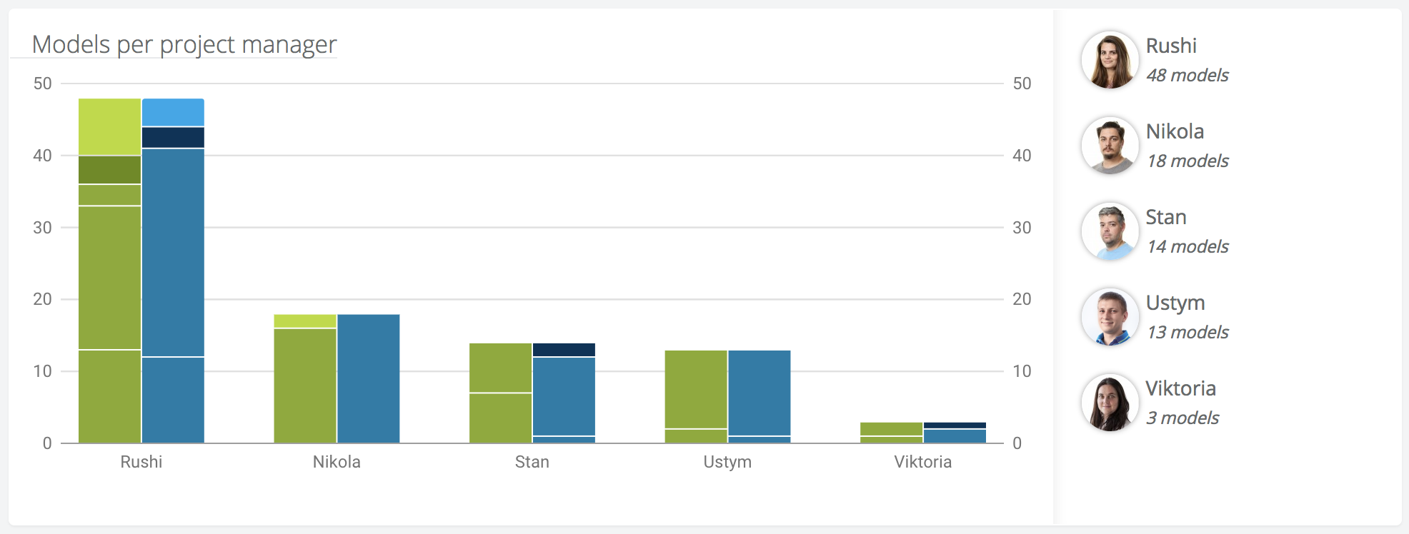
In order to improve this perception we decided to put a second bar where we can show the kind of models are the project managers working on.
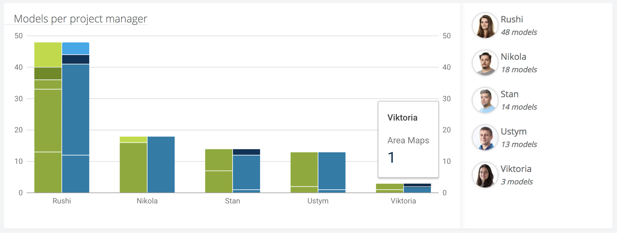
Furthermore exists the option of hover up for show the detail of each bar.
What’s next?
We are aware that this doesn’t show the information at a glance, and we would prefer work with a chart that show us the average time needed to each job. But to perform this we need a metric able to count the real work time spended on each job on the system.
This is the intermediate step until we can deploy a more intuitive chart