Client feedback UX
|
Jesús Burgos Maciá

Most of the work of this week has been focused on improving the UX of clients when they’re reviewing our produced models. Some of the updates are described below.
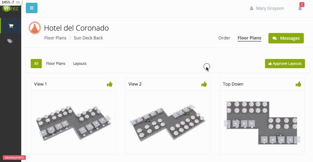
Approve buttons always visible
On models that had a lot of images, some of them would be quite far from the top of the page, it didn’t make sense to scroll up and find the button to approve. With the new approach, the buttons are always visible.
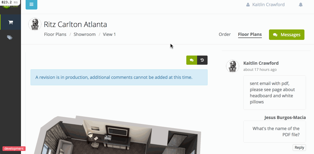
Comment replies
Some clients were having trouble to reply to our comments, we’ve updated the screen so they can see the button to reply right below the comment. This’ll load the page and focus on the text box so there’s no way to miss it.
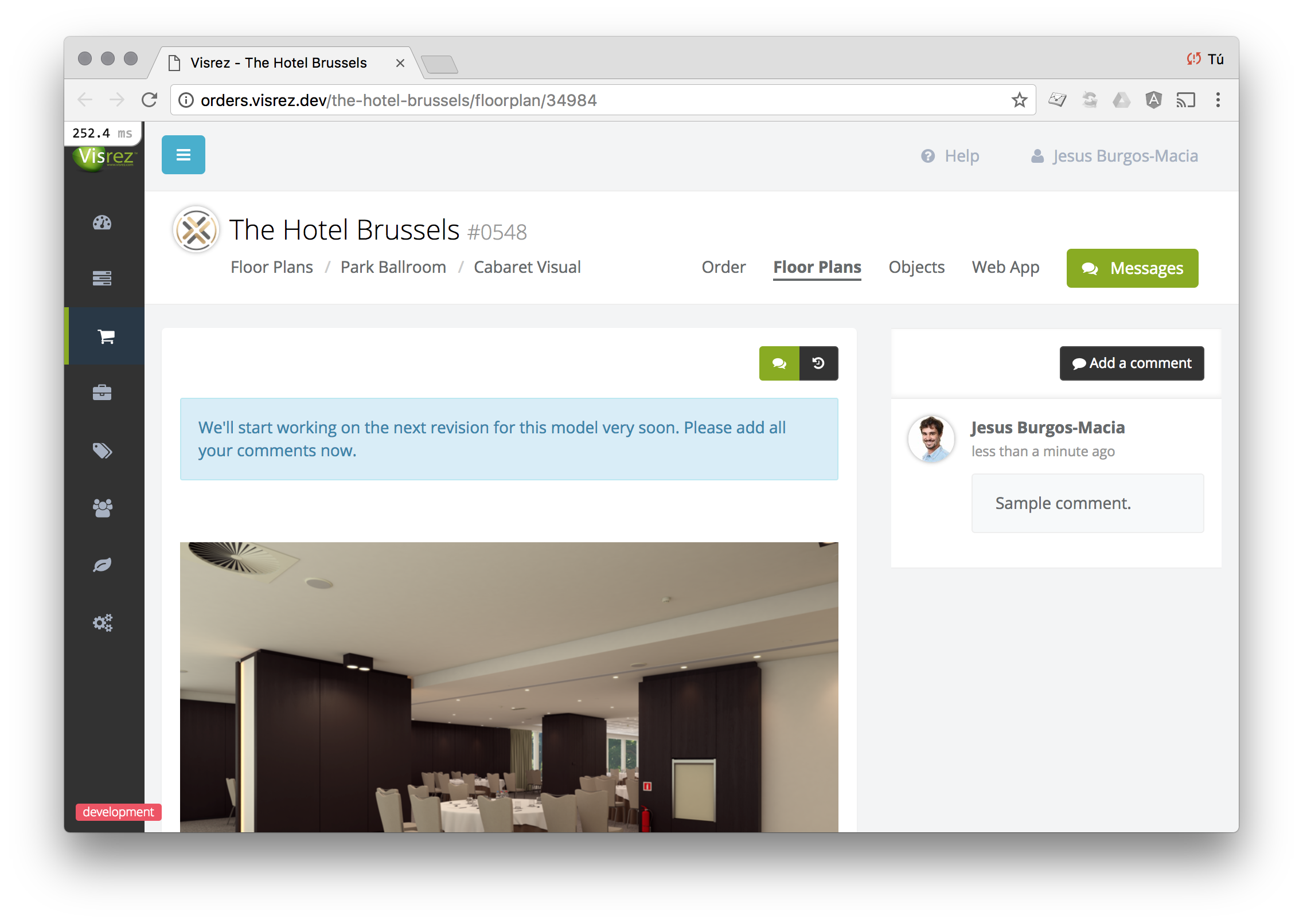
Feedback indications
At the top of the image, we’re showing a collection of messages that vary depending on the status of the model. This is to make it clearer for clients what we need them to do for us.
For example, when they send the first comment we’ll ask them to add all of the comments before we start working on the revision.
Other updates
- The background process that keeps the platform in sync with Dropbox has been improved so it should now be a bit faster and more reliable.
- Some bugs were fixed in relation to the image processing, some images would get stuck and never finish processing.